Neste tutorial, cobriremos os fundamentos da criação e uso de ListView no Flutter.
O que aprenderemos:
- Como criar um aplicativo usando o Flutter
- Como estruturar um novo projeto Flutter
- Como criar e renderizar
ListViewno Flutter
O que é flutuação?
Flutter é um kit de ferramentas de IU para celular e SDK de código aberto do Google. Ele é escrito em Dart, uma linguagem de programação também desenvolvida pelo Google.
Flutter é usado para desenvolver aplicativos da web móvel, como aplicativos nativos para iOS e Android ou aplicativos de desktop para Linux, macOS, Windows e ChromeOS. É um SDK completo, o que significa que fornece aos desenvolvedores tudo o que precisam para criar aplicativos: um mecanismo de renderização, componentes de IU, estruturas de teste, ferramentas, um roteador e muito mais.
O que torna o Flutter especial é a capacidade de “escrever uma vez, implantar em qualquer lugar”. Também é muito fácil se familiarizar com, independentemente de sua experiência em desenvolvimento móvel, desktop ou web.
O Flutter também tem muito controle e flexibilidade. Por exemplo, um aplicativo Android escrito em Flutter pode ser compilado para construir um desktop ou um aplicativo iOS; você não precisa escrever um novo projeto do zero quando deseja construir seu aplicativo para diferentes dispositivos. Essa funcionalidade também ajuda as empresas, porque não há necessidade de equipes separadas (por exemplo, web, iOS, Android) em um único projeto, porque um projeto será compilado em qualquer dispositivo principal.
Adoro usar o Flutter e posso dizer pessoalmente que o framework é incrível. Muito pode ser realizado com apenas algumas linhas de código, e o sistema de roteamento, segurança, ferramentas e testes foram abstraídos pelo framework, tornando meu trabalho muito fácil.
O que é ListView ?
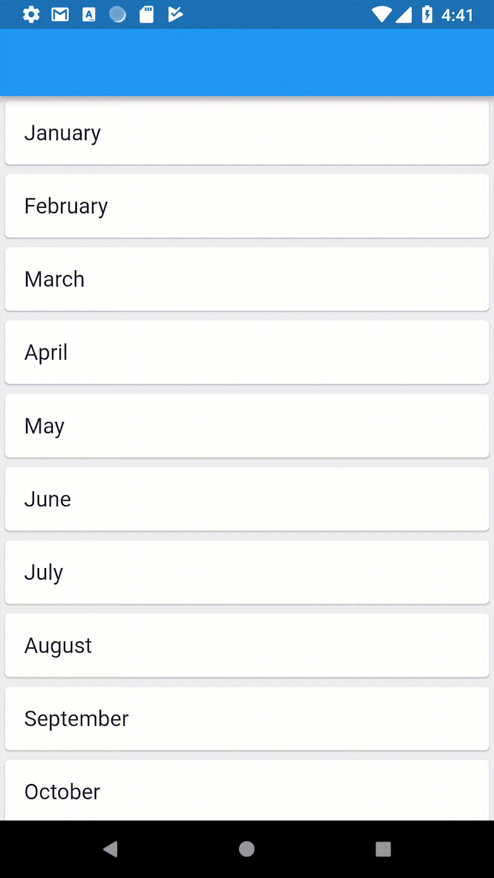
ListView é usado para agrupar vários itens em uma matriz e exibi-los em uma lista rolável. A lista pode ser rolada verticalmente, horizontalmente ou exibida em uma grade:
ListView s são comuns em estruturas de IU e um dos widgets de IU mais populares do mundo. Na verdade, qualquer aplicativo ou projeto móvel deve usar ListView de alguma forma. ListView s são usados em Android, iOS, aplicativos da web, Django e outras estruturas, onde executam o mesmo trabalho, mas às vezes com um nome diferente.
O
ListView tornou-se recentemente muito sofisticado. Por exemplo, o Android tem RecyclerView que se estende do widget básico ListView com controles e recursos mais complexos e poderosos.
ListView pode ser otimizado usando muitos truques diferentes e personalizado para atender às necessidades específicas do seu projeto. Examinaremos essas opções nas seções abaixo.
Construindo um projeto Flutter
Para começar, precisamos criar um scaffold para um aplicativo Flutter. Estas são as etapas iniciais para configurar o flutter e fazê-lo funcionar no macOS. Você pode seguir o guia de instalação do Flutter para outros sistemas aqui.
A primeira etapa é instalar o Android Studio ou Xcode para a plataforma para a qual deseja desenvolver. Neste tutorial, estarei desenvolvendo para Android. Em seguida, siga estas etapas:
- Baixe o pacote de instalação clicando neste link
- Descompacte e faça cd na pasta desejada:
 $ cd ~/pasta desejada
$ unzip ~/Downloads/flutter  macos  2.0.2-stable.zip
- Adicione vibração ao seu caminho:
$ export PATH="$ PATH: DIR TO YOUR_FLUTTER/flutter/bin"
- Execute
flutter doctorem seu terminal
Este comando fará o download do Flutter SDK e executará diagnósticos para determinar se tudo está pronto para uso. No final da corrida, você pode ter este resultado:
 [!] Android Studio (versão 4.1) ✗ Plugin Flutter não instalado; isso adiciona funcionalidade específica de Flutter. ✗ Plug-in Dart não instalado; isso adiciona funcionalidades específicas do Dart.
[!] Dispositivo conectado ! Nenhum dispositivo disponível
! O médico encontrou problemas em 4 categorias.
Se você não tem plug-ins Flutter e Dart em seu Android Studio, tudo o que você precisa fazer é:
- Abra o Android Studio
- Vá para Android Studio > Preferências…
- Clique em Plugins
- No painel direito, pesquise Flutter
- Nos resultados, selecione Flutter e instale-o
- Haverá uma opção para instalar o plug-in Dart também-certifique-se de aceitá-lo
- Clique em Plugins
Agora, precisamos executar o Android Virtual Manager. Para fazer isso, clique no ícone AVD Manager na seção superior direita do Android Studio. Uma caixa de diálogo aparecerá com um dispositivo AVD padrão. Na guia Ações , clique no ícone executar .
Agora, volte ao seu terminal e crie um projeto Flutter:
vibração criar meuaplicativo
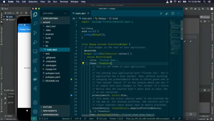
Isso criará um projeto Flutter com o nome da pasta myapp . Eu sugiro que você abra a pasta com o VS Code (contanto que você instale os plug-ins Dart e Flutter também) para que o desenvolvimento fique mais fácil.
Execute o projeto Flutter:
corrida vibratória
Você verá o Flutter sendo executado no AVD:
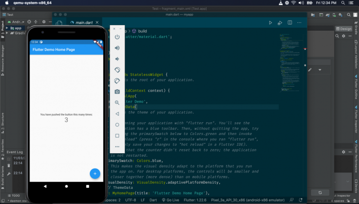
Trabalharemos no arquivo main.dart na pasta lib :
Em nosso main.dart , vemos o seguinte:
 void main () { runApp (MyApp ());
}
class MyApp extends StatelessWidget { //Este widget é a raiz do seu aplicativo. @sobrepor Construção de widget (contexto BuildContext) { return MaterialApp ( título:'Demonstração do Flutter', tema: ThemeData ( primarySwatch: Colors.blue, visualDensity: VisualDensity.adaptivePlatformDensity, ), home: MyHomePage (título:'Página inicial de demonstração do Flutter'), ); }
}
A função principal é o ponto de entrada do nosso aplicativo. Observe que ele chama o runApp passando na instância MyApp , que é um widget.
Olhando para MyApp , você pode ver que é um widget sem estado (o que significa que não contém nenhum estado local). Tudo no Flutter é um widget, e todos os widgets devem estender o StatelessWidget ou StatefulWidget e devem substituir ou implementar o método build . O método build deve retornar um widget, que é o que será exibido na tela.
Agora, qualquer widget passado na chamada runApp torna-se o widget raiz.
Aqui, o widget MyApp retorna um widget MaterialApp , que envolve seu aplicativo para passar funcionalidades específicas do Material Design para todos os widgets no aplicativo. O MaterialApp tem configurações a serem passadas. O title define o título na barra do aplicativo, o theme define o tema do display e o home define o widget que será renderizado na tela.
Removeremos o MyHomePage (...) e o substituiremos pelo widget ListView que iremos criar:
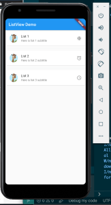
 class ListViewHome extends StatelessWidget { @sobrepor Construção de widget (contexto BuildContext) { return ListView ( preenchimento: const EdgeInsets.all (8), filhos:  [ Texto ('Lista 1'), Texto ('Lista 2'), Texto ('Lista 3'), ], ); }
}
Aqui, temos um widget ListViewHome . Observe que no método build , retornamos um widget ListView ; este widget é integrado ao Flutter e renderizará os dados da matriz transmitidos a ele em série.
Olhando para ListView , veja que o chamamos com props padding e children . O padding define o padding do elemento em seu contêiner. children é uma matriz, que contém widgets que serão renderizados por ListView .
Aqui, estamos renderizando textos. Criamos widgets Texto para passar o texto que desejamos renderizar a eles. Portanto, o ListView irá renderizar três widgets Texto com o seguinte texto: “List 1,” ”List 2,” e “List 3.”
Agora, iremos remover MyHomePage (title:'Flutter Demo Home Page') de MyApp e adicionar ListViewHome () :
 void main () { runApp (MyApp ());
}
class MyApp extends StatelessWidget { //Este widget é a raiz do seu aplicativo. @sobrepor Construção de widget (contexto BuildContext) { return MaterialApp ( título:'Demonstração do Flutter', tema: ThemeData ( primarySwatch: Colors.blue, visualDensity: VisualDensity.adaptivePlatformDensity, ), home: ListViewHome () ); }
}
Salve seu arquivo e o servidor Flutter será recarregado. Vá para o seu AVD para ver o resultado:

Observe como nossa lista de texto é renderizada. Mas isso não é muito atraente, vamos torná-lo mais estiloso:
 class ListViewHome extends StatelessWidget { @sobrepor Construção de widget (contexto BuildContext) { return ListView ( preenchimento: const EdgeInsets.all (8), filhos:  [ ListTile (title: Text ('List 1')), ListTile (title: Text ('List 2')), ListTile (title: Text ('List 3')), ], ); }
}
Aqui, usamos o widget ListTile do Flutter. Vamos ver o resultado:

O widget ListTile torna a renderização mais pronunciada e preenchida. O texto é separado de si mesmo para ser mais legível e elegante. ListTile é útil para criar algo como uma página de menu de configurações ou para listas de texto que não mudam.
Também podemos renderizar ícones, cartões, imagens e widgets personalizados com ListView .
Ícones em ListView
Para usar ícones em ListView , podemos usar o widget Icon substituindo o widget Texto :
 class ListViewHome extends StatelessWidget { @sobrepor Construção de widget (contexto BuildContext) { return ListView ( preenchimento: const EdgeInsets.all (8), filhos:  [ ListTile (title: Icon (Icons.battery_full)), ListTile (title: Icon (Icons.anchor)), ListTile (title: Icon (Icons.access_alarm)), ListTile (title: Icon (Icons.ballot)) ], ); }
}
O widget Icon renderiza ícones da IU de materiais. A classe Icons é usada para selecionar ícones por seus nomes:
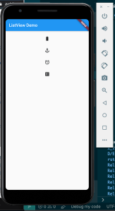
Observe como os ícones são renderizados no ListView . Vamos exibir o texto ao lado dos ícones:
 class ListViewHome extends StatelessWidget { @sobrepor Construção de widget (contexto BuildContext) { return ListView ( preenchimento: const EdgeInsets.all (8), filhos:  [ ListTile (title: Text ("Battery Full"), levando: Icon (Icons.battery_full)), ListTile (title: Text ("Anchor"), liderando: Icon (Icons.anchor)), ListTile (title: Text ("Alarm"), à esquerda: Icon (Icons.access_alarm)), ListTile (title: Text ("Ballot"), à esquerda: Icon (Icons.ballot)) ], ); }
}
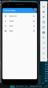
Usamos a prop principal para tornar o ícone o início de cada ListTile :

Os ícones também podem ser adicionados à direita do ListTile :
 class ListViewHome extends StatelessWidget { @sobrepor Construção de widget (contexto BuildContext) { return ListView ( preenchimento: const EdgeInsets.all (8), filhos:  [ ListTile (title: Text ("Battery Full"), à esquerda: Icon (Icons.battery_full), à direita: Icon (Icons.star)), ListTile (title: Text ("Anchor"), à esquerda: Icon (Icons.anchor), à direita: Icon (Icons.star)), ListTile (title: Text ("Alarm"), à esquerda: Icon (Icons.access_alarm), à direita: Icon (Icons.star)), ListTile (title: Text ("Ballot"), à esquerda: Icon (Icons.ballot), à direita: Icon (Icons.star)) ], ); }
}
O prop trailing é usado para definir widgets na extrema direita do ListTile :
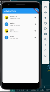
Podemos adicionar uma legenda em ListView usando a proposta subtitle :
 class ListViewHome extends StatelessWidget { @sobrepor Construção de widget (contexto BuildContext) { return ListView ( preenchimento: const EdgeInsets.all (8), filhos:  [ ListTile (title: Text ("Battery Full"), subtitle: Text ("The battery is full."), À esquerda: Icon (Icons.battery_full), à direita: Icon (Icons.star)), ListTile (title: Text ("Anchor"), subtitle: Text ("Abaixe a âncora."), À esquerda: Icon (Icons.anchor), à direita: Icon (Icons.star)), ListTile (title: Text ("Alarm"), subtitle: Text ("This is the time."), À esquerda: Icon (Icons.access_alarm), à direita: Icon (Icons.star)), ListTile (title: Text ("Ballot"), subtitle: Text ("Dê seu voto."), À esquerda: Icon (Icons.ballot), à direita: Icon (Icons.star)) ], ); }
}
O texto da legenda aparece abaixo do texto do título, com uma cor mais suave:

Imagens em ListView
No Flutter, podemos usar AssetImage e NetworkImage para renderizar imagens.
ListView é normalmente usado para exibir avatares ao lado de cada item. O Flutter tem um widget CircleAvatar para exibir a imagem do perfil de um usuário ou as iniciais quando ausente.
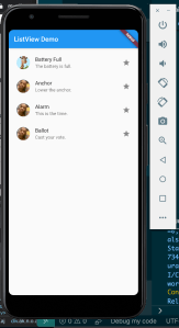
Vamos adicionar uma imagem ao lado dos itens em ListView :
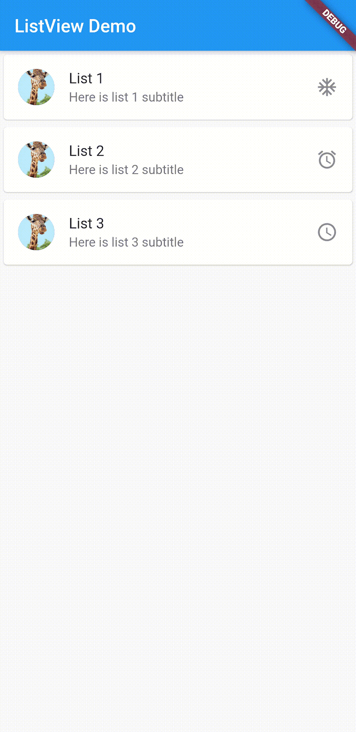
 class ListViewHome extends StatelessWidget { @sobrepor Construção de widget (contexto BuildContext) { return ListView ( preenchimento: const EdgeInsets.all (8), filhos:  [ ListTile ( título: Texto ("Bateria cheia"), subtítulo: Texto ("A bateria está cheia."), principal: CircleAvatar (backgroundImage: AssetImage ("assets/js.png")), à direita: ícone (Icons.star)), ListTile (title: Text ("Anchor"), subtitle: Text ("Lower the anchor."), À esquerda: CircleAvatar (backgroundImage: AssetImage ("assets/react.png")), à direita: Icon (Icons.star)) , ListTile (title: Text ("Alarm"), subtitle: Text ("This is the time."), À esquerda: CircleAvatar (backgroundImage: AssetImage ("assets/js.png")), à direita: Icon (Icons.star) ), ListTile (title: Text ("Ballot"), subtitle: Text ("Cast your vote."), Liderando: CircleAvatar (backgroundImage: AssetImage ("assets/react.png")), à direita: Icon (Icons.star)) ], ); }
}
Na propriedade principal , adicionamos o widget CircleAvatar , de forma que ListView comece com a imagem. O prop backgroundImage no CircleAvatar define a imagem de fundo do widget.
Usamos o widget AssetImage para carregar imagens da pasta de ativos local. Mas antes de carregarmos as imagens do diretório local, precisamos adicionar algumas seções ao arquivo pubspec.yaml :
ativos
: -ativos/
Agora, salve seus arquivos e o AVD renderizará as imagens em uma lista como esta:
Este é o ListView renderizando imagens em forma circular:
 CircleAvatar ( backgroundImage: AssetImage ("assets/react.png"), child: Text ('BA'),
)
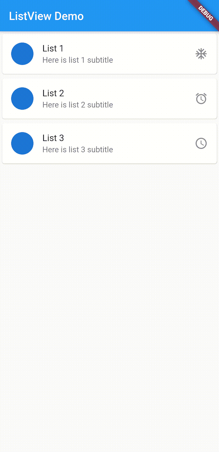
O valor prop child “BA” é exibido quando a imagem não é carregada. Você pode aprender mais sobre CircleAvatar aqui.
Podemos carregar nossas imagens da Internet em vez de nosso diretório local usando o widget NetworkImage em vez de AssetImage :
 class ListViewHome extends StatelessWidget { @sobrepor Construção de widget (contexto BuildContext) { return ListView ( preenchimento: const EdgeInsets.all (8), filhos:  [ ListTile ( título: Texto ("Bateria cheia"), subtítulo: Texto ("A bateria está cheia."), principal: CircleAvatar (backgroundImage: NetworkImage ("https://images.unsplash.com/photo-1547721064-da6cfb341d50")), à direita: ícone (Icons.star)), ListTile (title: Text ("Anchor"), subtitle: Text ("Lower the anchor."), Levando: CircleAvatar (backgroundImage: NetworkImage ("https://miro.medium.com/fit/c/64/64/1 * WSdkXxKtD8m54-1xp75cqQ.jpeg")), à direita: Ícone (Icons.star)), ListTile (title: Text ("Alarm"), subtitle: Text ("This is the time."), Levando: CircleAvatar (backgroundImage: NetworkImage ("https://miro.medium.com/fit/c/64/64/1*WSdkXxKtD8m54-1xp75cqQ.jpeg")), à direita: Ícone (Icons.star)), ListTile (title: Text ("Ballot"), subtitle: Text ("Cast your vote."), Levando: CircleAvatar (backgroundImage: NetworkImage ("https://miro.medium.com/fit/c/64/64/1 * WSdkXxKtD8m54-1xp75cqQ.jpeg")), à direita: Ícone (Icons.star)) ], ); }
}
Observe como substituímos AssetImage por NetworkImage . O NetworkImage pega a URL da imagem em seu construtor, o que faz com que o widget NetworkImage extraia a imagem da Internet e a renderize.
Para que a solicitação HTTP funcione, precisamos adicionar permissão ao nosso AndroidManifest.xml arquivo:
...
Recarregue o AVD, pare o Flutter e reinicie-o.
Veremos que a imagem foi obtida e renderizada:
Cards in ListView
Cards are used to display info in a concise and professional manner alongside a list. You can learn more about cards here.
To use Card in Flutter, we will use the Card widget.
The Card widget has a child prop that lays out a child widget, like this:
Card(child: Text("A card."))
The Card widget renders a Text widget with the text “A card.”
Let’s apply it to ListView so we can render Cards in it:
class ListViewHome extends StatelessWidget { @override Widget build(BuildContext context) { return ListView( padding: const EdgeInsets.all(8), children: [ Card(child:ListTile( title: Text("Battery Full"), subtitle: Text("The battery is full."), leading: CircleAvatar(backgroundImage: NetworkImage("https://images.unsplash.com/photo-1547721064-da6cfb341d50")), trailing: Icon(Icons.star))), Card(child:ListTile( title: Text("Anchor"),subtitle: Text("Lower the anchor."), leading: CircleAvatar(backgroundImage: NetworkImage("https://miro.medium.com/fit/c/64/64/1*WSdkXxKtD8m54-1xp75cqQ.jpeg")), trailing: Icon(Icons.star))), Card(child:ListTile( title: Text("Alarm"),subtitle: Text("This is the time."), leading: CircleAvatar(backgroundImage: NetworkImage("https://miro.medium.com/fit/c/64/64/1*WSdkXxKtD8m54-1xp75cqQ.jpeg")), trailing: Icon(Icons.star))), Card(child:ListTile( title: Text("Ballot"),subtitle: Text("Cast your vote."), leading: CircleAvatar(backgroundImage: NetworkImage("https://miro.medium.com/fit/c/64/64/1*WSdkXxKtD8m54-1xp75cqQ.jpeg")), trailing: Icon(Icons.star))) ], ); }
}
I enclosed the ListTile widget inside the Card widget. It will render the following:

We can use the ListView builder method to achieve the above with a more readable and maintainable approach:
class ListViewHome extends StatelessWidget { final titles=["List 1","List 2","List 3"]; final subtitles=[ "Here is list 1 subtitle", "Here is list 2 subtitle", "Here is list 3 subtitle" ]; final icons=[Icons.ac_unit, Icons.access_alarm, Icons.access_time]; @override Widget build(BuildContext context) { return ListView.builder( itemCount: titles.length, itemBuilder: (context, index) { return Card( child: ListTile( title: Text(titles[index]), subtitle: Text(subtitles[index]), leading: CircleAvatar( backgroundImage: NetworkImage( "https://images.unsplash.com/photo-1547721064-da6cfb341d50")), trailing: Icon(icons[index]))); }); }
}
ListView uses the builder method to build the list. I set the template of each list in the itemBuilder prop, and the number of the list in the itemCount prop.
The itemBuilder function returns the template. Note how it returns a Card widget with the ListTile, the same as our above example. See that the title, subtitle, and icon content is picked from the titles, subtitles, icons, and arrays respectively:

Using itemBuilder is better because it makes the ListView creation very flexible and dynamic.
Adding line separators
We can place a line between list items using the ListView``.``separated() method:
class ListViewHome extends StatelessWidget { final titles=["List 1","List 2","List 3"]; final subtitles=[ "Here is list 1 subtitle", "Here is list 2 subtitle", "Here is list 3 subtitle" ]; final icons=[Icons.ac_unit, Icons.access_alarm, Icons.access_time]; @override Widget build(BuildContext context) { return ListView.separated( separatorBuilder: (BuildContext context, int index)=> const Divider(), itemCount: titles.length, itemBuilder: (context, index) { return Card( child: ListTile( title: Text(titles[index]), subtitle: Text(subtitles[index]), leading: CircleAvatar( backgroundImage: NetworkImage( "https://images.unsplash.com/photo-1547721064-da6cfb341d50")), trailing: Icon(icons[index]))); }); }
}
The only difference between our previous example and this is the separated() method and the separatorBuilder prop.
It will turn out like this:
Styling ListView
ListView allows us to style and customize our list items to our taste.
To do so, we will discard ListTile. There are many widgets we can use to create our custom list items, but the most popular is the Container widget:
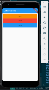
class ListViewHome extends StatelessWidget { @override Widget build(BuildContext context) { return ListView( padding: const EdgeInsets.all(8), children: [ Container( height: 50, color: Colors.orange[600], child: const Center(child: Text('List 1')), ), Container( height: 50, color: Colors.red[500], child: const Center(child: Text('List 2')), ), Container( height: 50, color: Colors.blue[500], child: const Center(child: Text('List 3')), ), ], ); }
}
We use Container to render custom styles, just like div in HTML.
In the above code, we passed in an array of four Containers to ListView. Each item in the array is a Container widget.
In each Container widget, we use the height property to set the height of the container and the color prop to set the background color. The child prop contains a single widget that will be rendered by the container.
In the child prop, we are using the Center widget to center the content in the middle of the container, while the child prop in the Center widget renders text.
See the result:
Touch events and dynamic adding in ListView
We can add a touch event to the items in our ListView. The touch event is attached to a touch handler, so when an item in the ListView is touched or pressed, the handler is executed. This is similar to the events we register in HTML/JS apps:
class ListViewHome extends StatelessWidget { final titles=["List 1","List 2","List 3"]; final subtitles=[ "Here is list 1 subtitle", "Here is list 2 subtitle", "Here is list 3 subtitle" ]; final icons=[Icons.ac_unit, Icons.access_alarm, Icons.access_time]; @override Widget build(BuildContext context) { return ListView.builder( itemCount: titles.length, itemBuilder: (context, index) { return Card( child: ListTile( onTap: () { Scaffold.of(context).showSnackBar(SnackBar( content: Text(titles[index] +'pressed!'), )); }, title: Text(titles[index]), subtitle: Text(subtitles[index]), leading: CircleAvatar( backgroundImage: NetworkImage( "https://images.unsplash.com/photo-1547721064-da6cfb341d50")), trailing: Icon(icons[index]))); }); }
}
Note that we added an onTap function prop to the ListTile with a function handler attached to it. This listens for the touch event in the ListView item, so whenever the list item is touched or pressed the function handler is executed. This displays a Snackbar when run, showing the “title” of the list item touched:
We can also add or remove items from ListView. To do that, we have to make our widget a stateful widget.
We can make ListViewHome a state widget by extending the class State.
A stateful widget will extend StatefulWidget class, and in its createState method call ListViewHome:
class ListViewHomeLayout extends StatefulWidget {
@override ListViewHome createState() { return new ListViewHome(); }
}
class ListViewHome extends State { List titles=["List 1","List 2","List 3"]; final subtitles=[ "Here is list 1 subtitle", "Here is list 2 subtitle", "Here is list 3 subtitle" ]; final icons=[Icons.ac_unit, Icons.access_alarm, Icons.access_time]; @override Widget build(BuildContext context) { return ListView.builder( itemCount: titles.length, itemBuilder: (context, index) { return Card( child: ListTile( onTap: () { setState(() { titles.add('List'+ (titles.length+1).toString()); subtitles.add('Here is list'+ (titles.length+1).toString() +'subtitle'); icons.add(Icons.zoom_out_sharp); }); Scaffold.of(context).showSnackBar(SnackBar( content: Text(titles[index] +'pressed!'), )); }, title: Text(titles[index]), subtitle: Text(subtitles[index]), leading: CircleAvatar( backgroundImage: NetworkImage( "https://images.unsplash.com/photo-1547721064-da6cfb341d50")), trailing: Icon(icons[index]))); }); }
}
Now, we will change the body prop in MyApp to render ListViewHomeLayout():
body: ListViewHomeLayout())
In the ListViewHome, look inside the onTap handler. We can use the setState method to add items to the titles, subtitles, and icons arrays. This will cause the ListView to re-render and the UI is updated with the latest item added:
Conclusão
We covered a lot on ListViews here!
We began with Flutter, how it works and how useful it is. Then, we covered how to download the Flutter SDK, export it, and configure your Android Studio for Flutter development. Next, we saw how to scaffold and run Flutter.
We then learned how to create a ListView, including different methods of creating instances of ListView statically and dynamically. We learned how to add separate lines in each item, how to register touch events in the list items, and how to add items to the ListView using Stateful widgets.
I hope you enjoyed reading this article as much as I did writing it, and learned some useful tricks to using ListView in your next project.
References
Flutter in Action — Eric Windmill
The post Creating ListViews in Flutter appeared first on LogRocket Blog.