Are you looking for a few hello bar examples for inspiration to create your own?
A hello bar can be an excellent way to greet new guests coming to your site for the first time. It can also be a critical moment for engaging your returning users, too.
But how can you make a hello bar that’s both professional looking and effective–especially when you’re working with limited “tech skills.”
Today, we’ll share our favorite hello bar examples to help you find the right look, style, and messaging for your site.
But first, let’s get clear on what a hello bar is in the first place.
What Is a Hello Bar?
A hello bar, more commonly known as a “floating bar” or “banner bar,” is a small campaign that sits on the top or bottom of your user’s browser screen.
This resting bar often has a welcome message of some kind and can be used to:
- Greet new visitors
- Welcome returning visitors
- Provide company updates
- Suggest popular content on your post
- Offer a lead magnet
- And much more…
A hello bar is a great alternative to a popup campaign because it can be less intrusive and remain on your user’s screen while they’re browsing your content.
That means you can potentially get more interaction with hello bars while keeping UX high across your site.
You can use hello bars to accomplish any of your marketing goals, as you’ll see by our hello bar examples in just a moment. They can be used to:
- Grow your email list
- Increase registrations for webinars
- Provide discounts and purchase incentives like free shipping
- Redirect to product pages to increase sales
And more. Hello bars are an awesome tool in your marketing tool belt, and one that you should consider if you haven’t already.
So now that we’re clear on what a hello bar is, let’s look at some hello bar examples you can be inspired by.
Hello Bar Examples
In this post, we’re going to show you a few popular hello bar examples from across the web. Then, we’ll provide a small How to Make It section at the end.
All of these hello bars were built with OptinMonster:
OptinMonster is the world’s #1 lead generation software on the market, and it’s the easiest tool for creating hello bars. It provides over 50 prebuilt templates that look great across all devices and a user-friendly drag and drop builder for modifications.
Plus, OptinMonster comes with advanced targeting rules, so you can be sure to reach the right people at the right time in their customer journey.
Whether your site attracts mostly new leads or re-attracts loyal readers, OptinMonster is hands down your best bet for turning traffic into leads.
And a well-crafted hello bar is just the campaign you need to do it.
With that in mind, let’s check out our favorite hello bar examples.
Remember, the term “hello bar” and “floating bar” refer to the same thing and will be used interchangeably throughout the rest of the post.
And since this is such an in-depth resource for hello bar examples, we’ve broken each one down by it’s primary function. But we also give insight on how to create the campaign yourself and why the example we chose is a good one.
For your convenience, feel free to use the following table of contents to navigate through this guide:
- Grow Your List
- Attract New Leads
- Drive More Sales
- Connect With Your Audience
- Educate Your Site’s Visitors
- Offer Lead Magnets
- Create a Sense of Urgency
- Give Discounts and Coupons
- Target Campaigns to Your Ideal Buyer
- Boost Conversions on Landing Pages
- Integrate With Your Email Provider
- Empower Your Audience
- Design Professional Campaigns Quickly
Let’s dive into the list.
1. Grow Your Mailing List
The first of our hello bar examples is a simple floating bar from ActiveCampaign that displays at the bottom of the page:
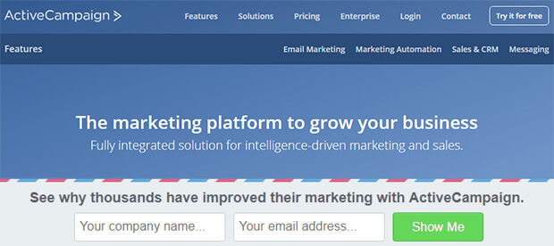
This is a simple floating bar with an email signup form, which works great for building your email marketing list.
The campaign uses OptinMonster’s Postal theme, so it contrasts with the main web page. ActiveCampaign changed the copy to include social proof (“thousands have improved their marketing”) and curiosity (“see why”).
This is a winning combination, resulting in 800 new signups every month. Read the full ActiveCampaign case study for more details.
How to Make It
For this, ActiveCampaign used OptinMonster’s Postal Template:
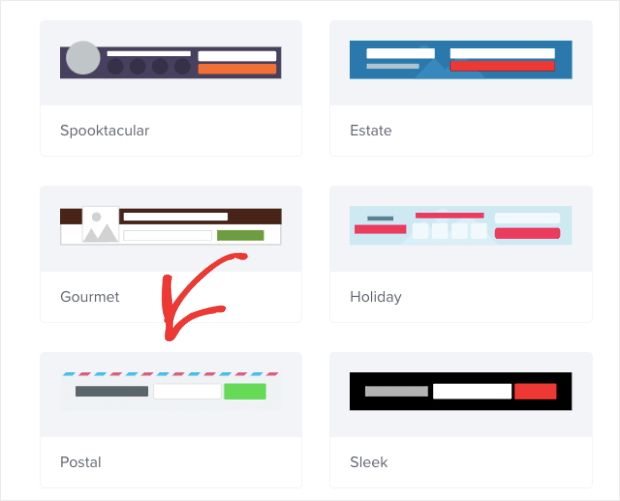
Once you see what the template looks like in the editor, you’ll notice that they made a few modifications:
- Changing the button color
- Adding the Name field to the signup form
- Put the text over the signup form rather than to the side

With our inline text editor and drag and drop builder, these changes likely took less than 5 minutes to make.
That means within 5 minutes, ActiveCampaign had a professional hello bar running live on their site.
2. Attract New Leads
Advisor Coach also got great results by using a floating bar campaign on all of its blog posts.
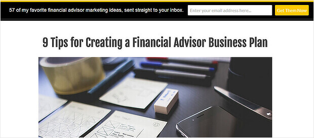
The black hello bar contrasted with the white web pages, and the yellow call to action button really stood out.
Although we’d have gone for more contrast to make the button text really pop, this floating bar worked well for Active Campaign. On those pages, they doubled their conversions.
See how The Advisor Coach increased sitewide conversions by 360% with OptinMonster.
How to Make It
One thing that the Advisor Coach was concerned about was targeting mobile users.
That’s because much of their traffic came from smartphones, so they needed campaigns that would look great on mobile devices.
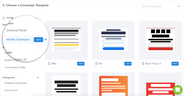
With OptinMonster’s template options, you can filter out template styles by device:
From there, they used out Split template and changed the background color from white to black in the campaign builder:
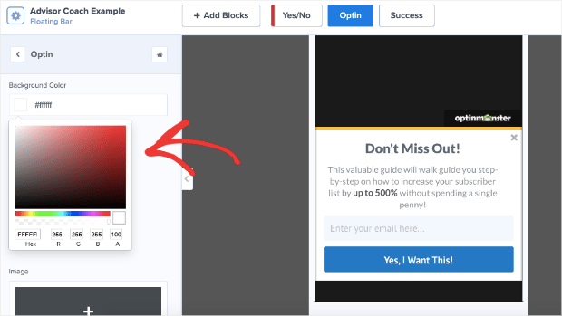
Only minor modifications needed to be made after that with our inline text editor.
Again, this campaign was likely created in under 5 minutes.
3. Drive More Sales
Digital Marketer liked our hello bar alternative so much that they used it on two sites: their own and TruConversion.
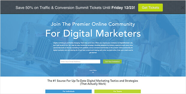
This notification bar optin uses Yes / No buttons instead of an optin form, making it easy to drive traffic to the right landing page.
In both cases, they used contrasting colors for their floating bars. They also triggered the fear of missing out (FOMO) in visitors by putting a definite end date for their offer.
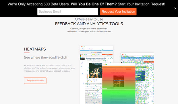
The results: an 8.45% conversion rate for one hello bar, and 6.62% for the other.
How to Make It
For this, we’ll focus on the Yes/No aspect of the campaign creation. Adding a Yes/No feature is a great way to boost engagement with your campaign.
That’s because once people begin a process, they’re more likely to finish. And since it’s easier to get people to click “Yes” than type in their personal contact information, a Yes/No campaign is the best way to get things rolling.
In the OptinMonster editor, you can click Yes/No at the top of the screen:
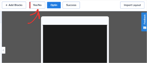
Then click the button that says Enable Yes/No for This Campaign:
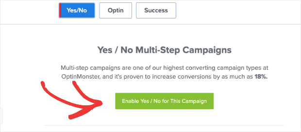
And your Yes/No view will automatically appear in the editor:
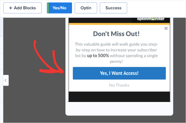
Now you’ll only need to make minor changes to find the right messaging that connects with your audience. Which leads to our next hello bar example…
4. Connect With Your Audience
While researching hello bar examples, we found a good one from Dogs Naturally.
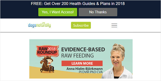
This is a great example because of the copy. It entices customers with a lead magnet and a big number and makes it clear it’s relevant by including the current year.
Plus this floating bar uses OptinMonster’s Yes/No forms, which are proven to convert well.
How to Make It
What stood out to us was the clever copy. “Copy” simply means the persuasive wording used to get people to engage with your campaign.
To change the wording in any OptinMonster campaign, hello bars included, you can simply use our inline editor:
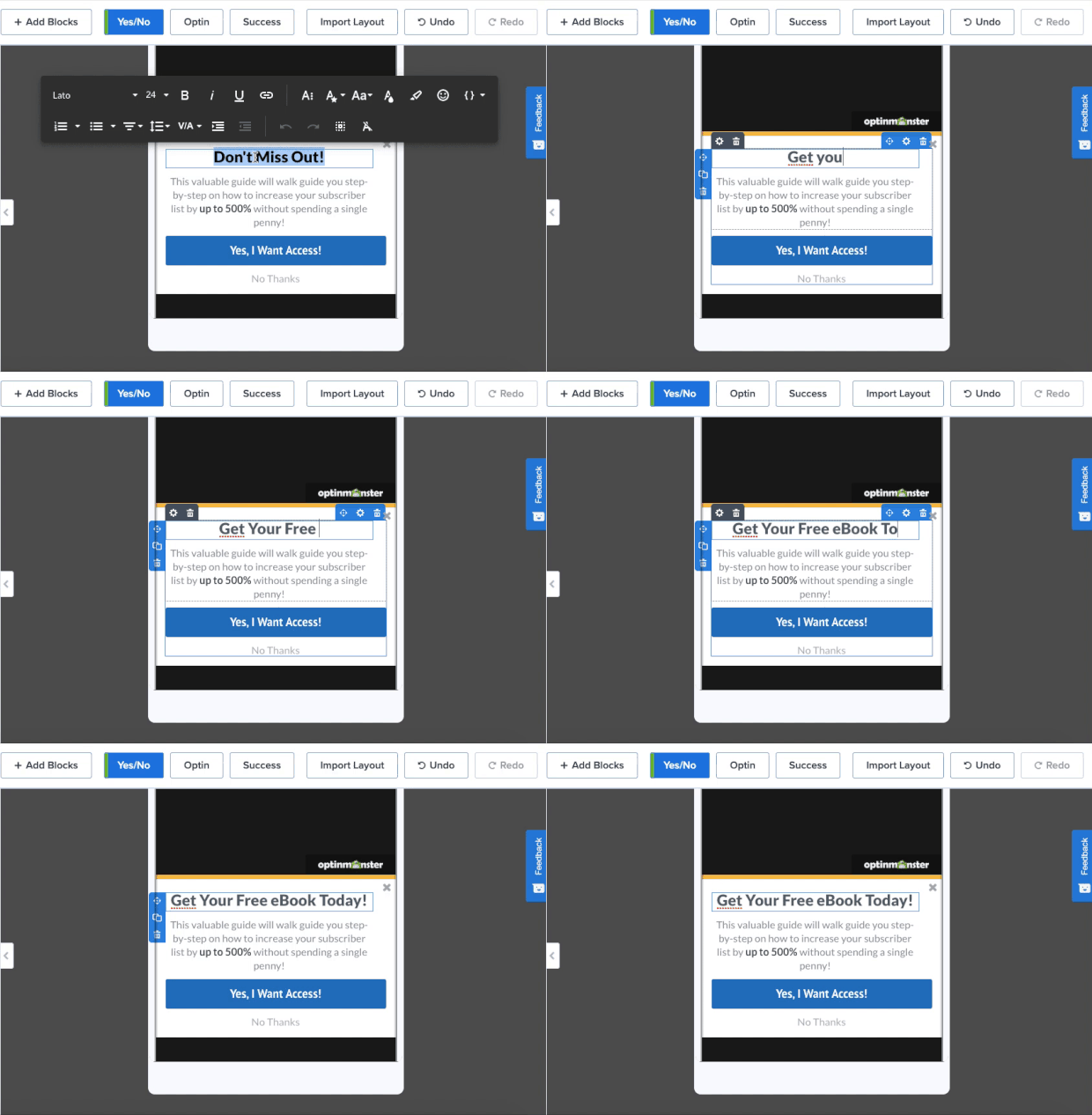
This allows you to quickly make changes to your campaign’s copy to find the message the most resonates with your audience.
5. Educate Your Site’s Visitors
Here’s another creative use of OptinMonster, which is great for content producers. Envira Gallery keeps it simple by using its floating bar optin to encourage visitors to move deeper into the site.
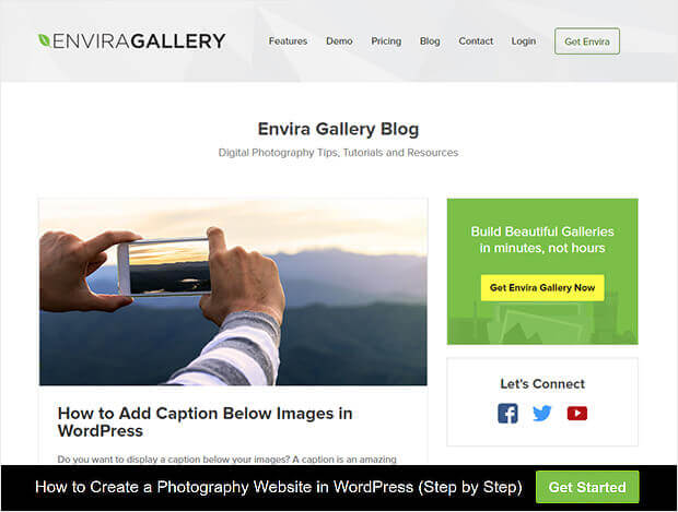
Envira’s used a Yes/No form but has switched off the No button to provide a button redirecting visitors to a piece of pillar content.
This is a smart move because it avoids asking for anything upfront, and rewards the click with a valuable resource. You can use this kind of floating bar to direct your visitors to content that you know converts.
How to Make It
Earlier we covered how to enable the Yes/No feature. But now, let’s look at how you can remove the No option from your hello bar like in the example above.
Hover your mouse over the Yes/No button and locate the trashcan icon:
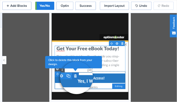
Click on that to remove the Yes/No field from your campaign. Then click + Add Blocks at the top of your editor:
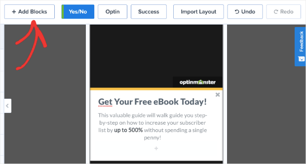
Finally, locate the Button block so you can drag and drop it into place (where the Yes/No button block used to be):
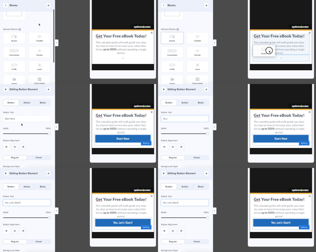
You’ll notice you can also easily change the button text in the left-hand side editing menu.
6. Offer Lead Magnets
The OptinMonster floating bar optin example on Jeff Bullas’ site mirrors his navigation bar, which means it tends to blend in when visitors scroll. However, it’s pretty effective when visitors first land on the site.
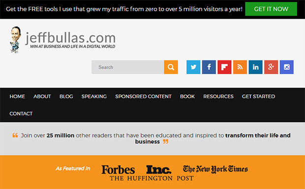
This black hello bar combines compelling social proof (“5 million visitors a year”) with the enticing offer of free information.
The green call to action button is highly visible – visitors won’t miss it.
How to Make It
What makes this campaign so effective is the design. Again, that green button is why the campaign stands out so much in the first place.
Otherwise, it would simply blend in with the rest of the site.
If you want a simple modification like that, you can easily change the button color. Just click on the button in your campaign block and pull up the editing tools on the left-hand side:
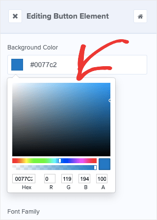
Then you can modify the color of your campaign to make it perfectly match your brand OR stand out to grab your user’s attention.
7. Create a Sense of Urgency
If you’re interested in hello bar examples with a direct impact on the bottom line, check out Kennedy Blue.
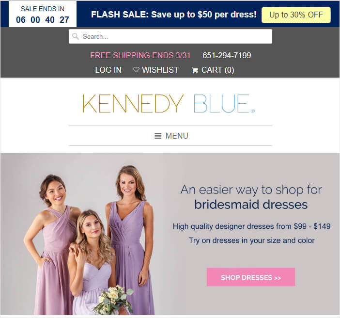
This dark blue floating bar grabs visitors’ attention as it contrasts with the pastel tones on the rest of the site. The white text is highly visible, and combined with the countdown timer and coupon code, creates urgency for visitors.
It’s no surprise that this floating bar boosted sales by 50%.
Also, you might want to check out our list of 6 incredibly easy floating bar hacks to boost your conversions.
How to Make It
Here you’ll notice that the key of Kennedy Blue’s success was in creating urgency for the users. For that, they used a countdown timer.
Doing that is easy. Click + Add Blocks at the top of your editor (we did this earlier to add a button):

Then locate the block Countdown Timer from the left-hand side menu. From there, you can drag and drop it into place:
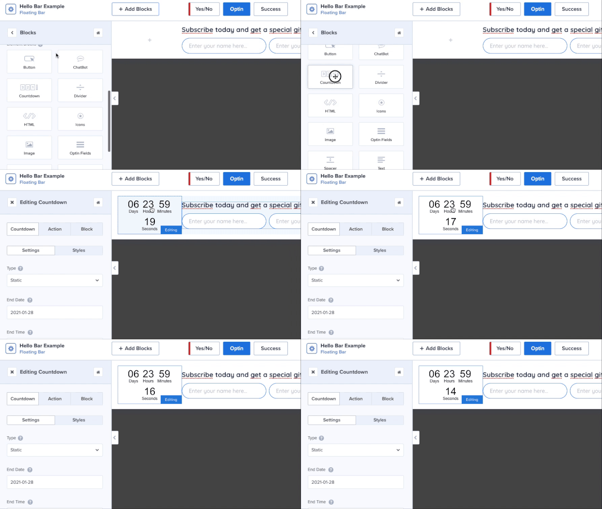
You’ll notice that the styling of the countdown timer will need some changes. When you click on the Countdown Timer block, you’ll see the editing options in the left-hand side menu:
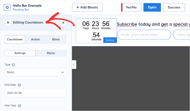
This allows you to quickly and easily make the modifications you need to build urgency for your users.
8. Give Discounts and Coupons
While we’re on the subject of making sales, a hello bar on the pricing page really paid off for LifterLMS.
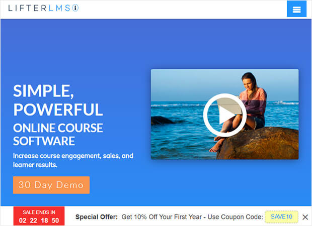
Like the example above, the company included a clear offer with a coupon code and used a countdown timer to create urgency. In just five months, this campaign brought in $23,700 in sales, as well as 7,000 new leads that Lifter would have missed out on.
How to Make It
This one’s super easy. Want to create the hello bar example from above? The one with the countdown timer AND the embedded coupon?
You can simply use OptinMonster’s Countdown template:
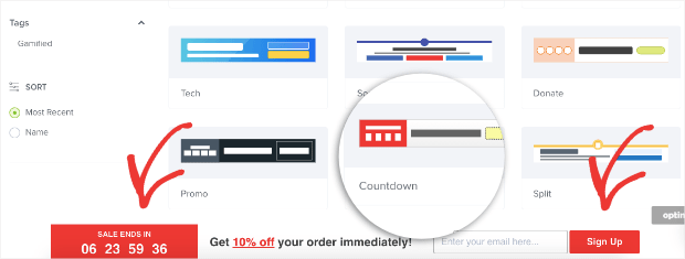
This has everything you need to replicate LifterLMS’s campaign to see the same awesome results.
9. Target Campaigns to Your Ideal Buyer
Optimize My Airbnb uses some of the methods we’ve already seen to make its hello bar stand out.
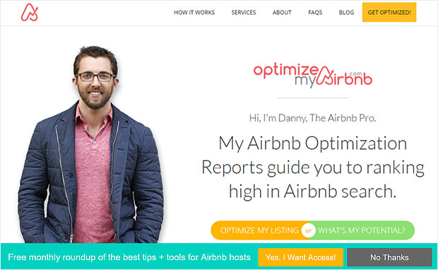
For example, the green background contrasts with the site, making the bar visible.
The yellow call to action button stands out, too, and there’s a clear statement of what’s on offer when visitors sign up. The use of yes/no forms will also help this campaign convert well. Here are some more creative ways to integrate yes/no forms into your marketing.
How to Make It
One thing about campaigns like these is they might now be the right for every single page on your site.
In some cases, you’ll want a hello bar on your homepage, but not on a product page. Or perhaps you want a floating bar on your blog posts, but you have other campaigns running for landing pages.
Whatever the reason, setting up campaigns for specific pages is super easy. Go to Display Rules in your OptinMonster editor:
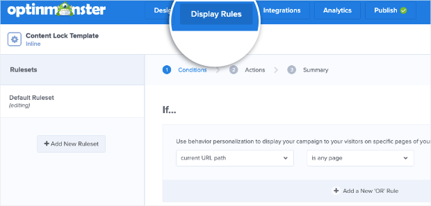
Then you can select the URL path you want this to show up on. You can choose from many options, like:
- Any page
- The homepage
- Pages other than the homepage
- URL exactly matches
- And much more
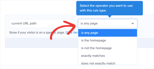
With just a few clicks from this clearly displayed drop-down menu, you can place all of your hello bars exactly where you want. And the best part is that you don’t need any tech skills or coding experience to do so.
10. Boost Conversions on Landing Pages
As you’d expect, we use floating bars, too. In fact, they’re our favorite way to announce a sale or a deal. Typically, you’ll see our floating bar optin at the top of the OptinMonster pricing page, where visitors can’t miss it.
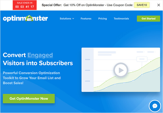
We usually stick to the default countdown timer color scheme, which is a white notification bar, with black text, a red countdown button, and a yellow coupon code.
Does it work well for us? All we’re going to say is: we use it every year on all our sites, so what do you think?
How to Make It
Like LifterLMS, this uses the Countdown template:

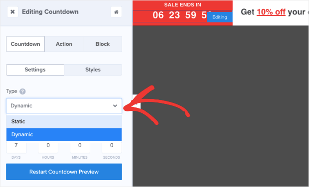
One thing you may want to note about the countdown timer is that you have 2 options:
- Static
- Dynamic
Static countdown timers have a fixed start and end date. Dynamic countdown timers, on the other hand, start when the user first sees it and ends after a specific amount of time.
That way, everyone has the same amount of time to take you up on your offer.
So let’s say you have a new site visitor named Frank who comes on a Tuesday. Frank sees that he has 7 days to make a purchase and redeem his discount. That means Frank’s sale ends next Tuesday.
But then you get another new visitor on Wednesday. We’ll call her Sarah.
Sarah’s countdown timer also gives her 7 days to take you up on your offer, so her discount will expire next Wednesday.
Even though Frank and Sarah saw their deal on different days, a dynamic countdown timer will give them the same amount of time to redeem the offer.
To change your countdown timer from static to dynamic, simply click on the countdown timer in your OptinMonster editor.
Then you can change the type of timer you want in the left-hand side editing menu:
Doing this allows you to create more targeted incentives for your audience. As a result, you can expect conversion rates to go way up.
11. Integrate With Your Email Provider
Stacy Portugal’s floating bar picks up the color in the site’s logo to create visual harmony.
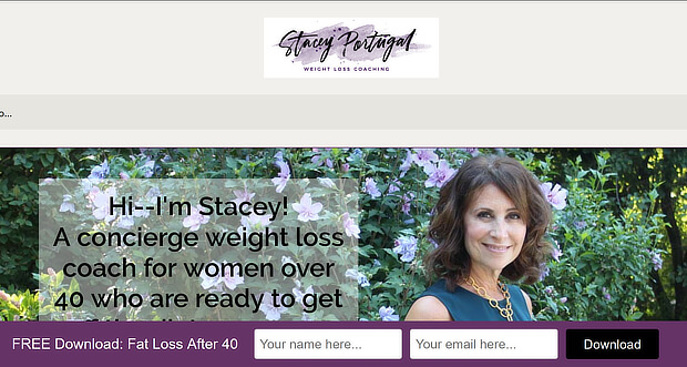
The white text contrasts well with the notification bar’s background, and there’s a clear and simple call to action to download the site’s lead magnet.
How to Make It
This campaign uses our Split template with a slight modification in the background and button color. What’s important here, however, is delivering the lead magnet once the new visitor signs up.
For that, you’ll want to integrate the hello bar with your email service provider (ESP) or use Monster Leads™ to store your new contacts.
Both can be done from the Integrations portion of your OptinMonster editor:
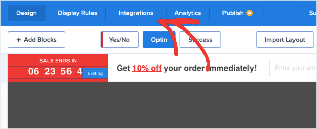
From the left-hand side menu, you can select your ESP from the drop-down list. If you used TotalSend, for example, you’d select that option:
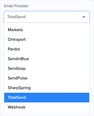
OptinMonster syncs natively with most major ESPs on the market. And if you don’t see yours on the list, you can connect any ESP with webhooks.
But sometimes you may want to store your new leads separately from your ESP. This helps you keep a backup of your new leads in case you run into trouble with your ESP. For that, you’ll select Monster Leads™ from the drop-down menu:
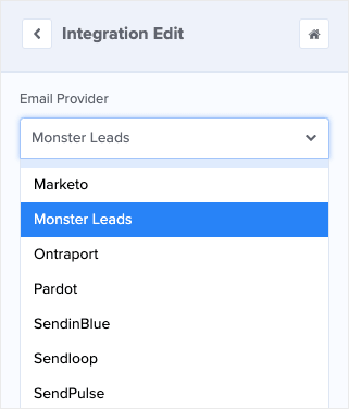
You can hook up your ESP and Monster Leads™ simultaneously. When new leads go to your ESP, you can set up an automated email series to deliver your lead magnet.
12. Empower Your Audience
The US Student Loan Center got great results when using OptinMonster as a hello bar alternative. The organization got smart and used several types of OptinMonster campaigns to promote their lead magnet and engineer a 10% increase in sales.
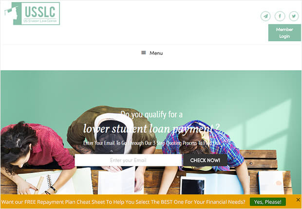
This yellow hello bar example contrasts with the muted tones on the site and uses Yes/No form with the No button turned off to provide a single call to action.
How to Make It
This is a very subtle and easy-to-make campaign. In fact, you could replicate this campaign in under 3 minutes using our Alert template:
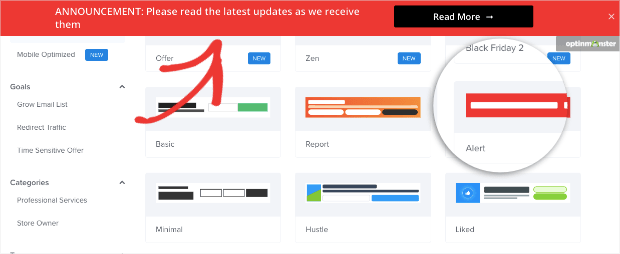
All you’d need to do is change the text, background color, and button color. Then you can add the link to a landing page or product page by modifying the Button Action. For that, click on the button to pull up the editing tools on the left-hand side.
Next, change the Button Click Action to say “Redirect to a URL” and add the URL in the field box below:
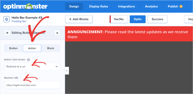
Then when uses click your Yes button, they’ll be redirected where you want them.
13. Design Professional Campaigns Quickly
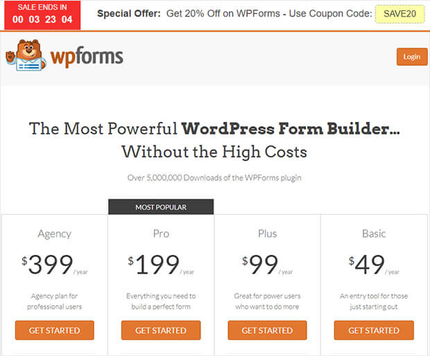
Finally, here’s another example of the countdown timer floating bar in action. This time, it’s on WPForms. You can’t miss the red timer to evoke urgency, and there’s a clear deal on offer for visitors.
How to Make It
This is another example of OptinMonster’s Countdown timer template. Again, this is a great one to use when you’re in a pinch because you won’t need to modify much.
Once you change the copy, add your coupon, and modify the colors, you can simply add this countdown timer to your product page’s URL like we’ve seen before:
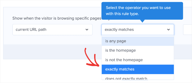
Then simply type in the URL of your pricing page and your campaign will be ready to roll!
And that’s it! These have been 13 hello bar examples you can start using today.
We hope you found this post helpful. If you did, you might also be interested in the following resources:
- 6 Simple Floating Bar Hacks to Boost Conversions
- How to Add a Free Shipping Bar to Your Online Store
- How to Create a Website Notification Bar to Keep Visitors Informed
These posts will have everything you need to learn how floating bars can boost your conversions and skyrocket your sales.
Ready to try for yourself? Sign up for your 100% risk-free OptinMonster account today.
The post 13 Creative Hello Bar Examples Proven To Boost Conversions appeared first on OptinMonster.
