Widgets are the building blocks of any Flutter app. Knowing when and how to use widgets is a fundamental skill for any developer looking to build cross-platform apps with Flutter.
In this tutorial, we’ll explore some of the most-used Flutter widgets. We’ll demonstrate how to use widgets to lay out your app, add text and input fields, create icons and images, and more.
Here’s what we’ll cover:
- What is Flutter?
- Building an example Flutter app with widgets
- Layout widgets
- Text widgets
- Input widgets
- Assets, images, and icon widgets
To follow along with this Flutter widgets tutorial, you should have:
- Familiarity with Dart programming language
- An iOS or Android simulator/emulator for testing
- A code editor (e.g., VS Code)
- A basic understanding of React
What is Flutter?
Flutter is an open-source UI software development tool kit created by Google that is used to develop applications for iOS, Android, Linux, Mac, Windows, Google Fuchsia, and the web from a single codebase. Flutter is written with the Dart programming language, which makes it an ideal framework for cross-platform software development.
Dart is a client-optimized, object-oriented language with C-style syntax for building mobile, web, server, and desktop applications.
Installing the Flutter SDK
To build a Flutter app, you need to have the Flutter SDK installed on your development machine.
Mac
First, download the latest stable version of the Flutter SDK for the Mac operating system.
Copy/paste the following code in your terminal. Navigate to your downloads folder and extract the flutter SDK into your development folder.
 cd ~/development
unzip ~/Downloads/flutter_macos_2.0.3-stable.zip
Next, add the Flutter tool to your $PATH:
export PATH="$PATH:`pwd`/flutter/bin"
This only sets your current terminal session $PATH. To add the Flutter tool to your global $PATH use the code below:
export PATH="$PATH:[PATH_OF_FLUTTER_GIT_DIRECTORY]/bin"
Be sure to change [PATH_OF_FLUTTER_GIT_DIRECTORY] to the location of your Flutter SDK.
Run Flutter doctor to install other required dependencies. Run which flutter to confirm successful installation. You should have an output similar to the one below:
$ which flutter /path-to-flutter-sdk/bin/flutter
Windows
Download the latest stable version of the Flutter SDK for Windows.
Extract the downloaded .zip file and place the Flutter folder in your desired installation location for your flutter SDK (e.g., C:\src\flutter)
To run the Flutter command from any location within your console, follow the steps below:
- From the Start search bar, enter
envand select Edit environment variables for your account - Under User variables, check whether there is an entry called Path
- If the entry exists, append the full path to
flutter\binusing;as a separator from existing values - If the entry doesn’t exist, create a new user variable named
Pathwith the full path toflutter\binas its value
Building an example Flutter app with widgets
Now that we’ve installed and set up the Flutter SDK, let’s actually build a Flutter app to demonstrate how widgets work.
Open your Terminal (for Mac users) or command prompt (for Windows users). Run the command below to create a new Flutter app:
flutter create flutter_widegets
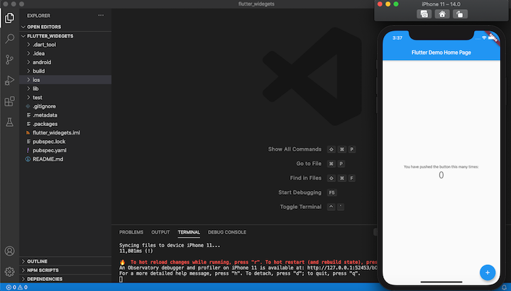
Open your simulator and Flutter run to run the default Flutter app. You should have an output similar to the screenshot below:
With our basic Flutter app set up, let’s take a closer look at some popular widgets and see how they work and when to use them.
Layout widgets
In this section, we’ll demonstrate how to create a layout in Flutter using Material Component widgets.
Scaffold
The Scaffold class is like the architectural diagram of a Flutter application. It usually contains the sections, such as the body, appBar, title, etc., that comprise the basic Material Design visual layout structure.
Copy/paste the code below in your main.dart file:
import 'package:flutter/material.dart';
void main() => runApp(MyApp());
class MyApp extends StatelessWidget { // This widget is the root of your application. @override Widget build(BuildContext context) { return MaterialApp( debugShowCheckedModeBanner: false, title: 'Flutter Widgets', theme: ThemeData( primarySwatch: Colors.green, ), home: App(), ); }
}
class App extends StatelessWidget { @override Widget build(BuildContext context) { return Scaffold( appBar: AppBar( centerTitle: true, title: Text('Log Rocket'), backgroundColor: Colors.green[600], )); }
}
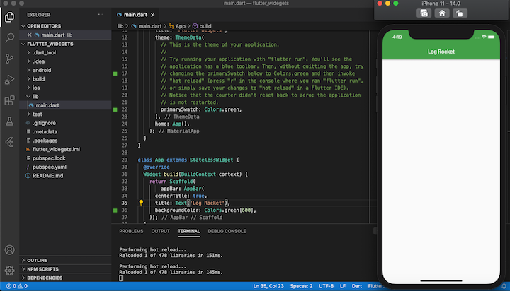
To refresh your app, press r on your terminal where an instance of the app is running. It should look like this:
Container
If, like me, you’re coming from a web development background, you should be familiar with containers. A container is a div that acts as a parent to other divs, which automatically become its direct children.
In Flutter, the container is shipped with default padding that helps in positioning its direct descendants or children by adding extra spaces around them. If you leave the child element or elements with no padding or margin, the default styles will be inherited.
When you specify width or height or any constraints property within the container, it automatically loses its default behavior. You can read more about the container widget and its constraint via the official docs.
Padding and margin
The EdgeInsets class enables you to set padding and margin to specific aspects of your Flutter app elements. The EdgeInsets also has other options:
 - `EdgeInsets.all()`
 - `EdgeInsets.only(left: 0, top: 0)`
 - `EdgeInsets.symmetric(vertical: 0, horizontal: 0)`
 - `EdgeInsets.fromLTRB(left, top, right, bottom)`
To see EdgeInsets in action, update the main.dart with the code below:
import 'package:flutter/material.dart';
void main() => runApp(MyApp());
class MyApp extends StatelessWidget { // This widget is the root of your application. @override Widget build(BuildContext context) { return MaterialApp( debugShowCheckedModeBanner: false, title: 'Flutter Widgets', theme: ThemeData( primarySwatch: Colors.green, ), home: Scaffold( appBar: AppBar( centerTitle: true, title: Text('Log Rocket'), backgroundColor: Colors.green[600], ), body: App(), ), ); }
}
class App extends StatelessWidget { @override Widget build(BuildContext context) { return Container( color: Colors.green, margin: EdgeInsets.only(top: 30, bottom: 50)); }
}
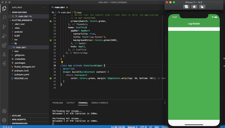
When you reload the app, it should look like this:
Rows and columns
Row and Column are two of the most frequently used layout patterns in Flutter. A Row and Column each take a list of child widgets. They can be aligned vertically and horizontally using the MainAxisAlignment and CrossAxisAlignment classes with specific constraints.
import 'package:flutter/material.dart';
void main() => runApp(MyApp());
class MyApp extends StatelessWidget { // This widget is the root of your application. @override Widget build(BuildContext context) { return MaterialApp( debugShowCheckedModeBanner: false, title: 'Flutter Widgets', theme: ThemeData( primarySwatch: Colors.green, ), home: Scaffold( appBar: AppBar( centerTitle: true, title: Text('Log Rocket'), backgroundColor: Colors.green[600], ), body: App(), ), ); }
}
class App extends StatelessWidget { @override Widget build(BuildContext context) { return Row( mainAxisAlignment: MainAxisAlignment.spaceEvenly, crossAxisAlignment: CrossAxisAlignment.center, children: <Widget>[ Container( color: Colors.green, height: 50, width: 100, child: Text("First Text"), ), Container( color: Colors.green, height: 50, width: 100, child: Text("Second text"), ) ], ); }
}
Text widgets
You may have noticed that we used a text widget in the previous example. In this section, we’ll explore the Text class and its available properties.
The Text widget displays a string of text with a single style. It has an optional style property; when not specified, the text will inherit the properties and styling from its closest parent:
Text( 'Hello, I am Emmanuel!', textAlign: TextAlign.right, overflow: TextOverflow.ellipsis, style: TextStyle(fontWeight: FontWeight.bold),
)
Let’s say you want to display a paragraph of text with multiple spans and specific styling. You can do this using Flutter’s Text.rich constructor:
const Text.rich( TextSpan( text: 'Hello', // default text style children: <TextSpan>[ TextSpan(text: ' beautiful ', style: TextStyle(fontStyle: FontStyle.italic)), TextSpan(text: 'world', style: TextStyle(fontWeight: FontWeight.bold)), ], ),
)
Input widgets
There are four widgets available to access and manage user input in a flutter. We will cover two of them; you can read more about input widgets in the Flutter docs.
FormField
A single form field is responsible for managing and tracking the FormField’s state. If used within the Form widget, you can use methods on FormState to query or manipulate the form data as a whole.
For example, calling FormState.save will invoke each FormField‘s onSaved callback in turn.
Form
The Form class is an optional container used to group FormFields (e.g., the TextField).
Now let’s see the Form and FormField in action. Replace the main Dart code with the code below:
import 'package:flutter/material.dart';
void main() => runApp(MyApp());
class MyApp extends StatelessWidget { // This widget is the root of your application. @override Widget build(BuildContext context) { return MaterialApp( debugShowCheckedModeBanner: false, title: 'Flutter Widgets', theme: ThemeData( primarySwatch: Colors.green, ), home: Scaffold( appBar: AppBar( centerTitle: true, title: Text('Log Rocket'), backgroundColor: Colors.green[600], ), body: App(), ), ); }
}
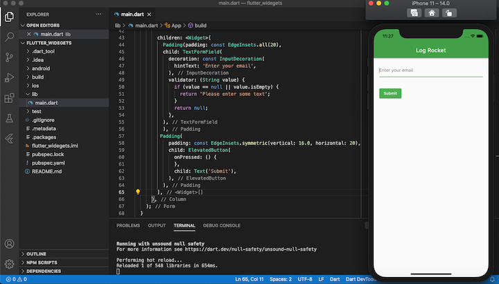
class App extends StatelessWidget { @override Widget build(BuildContext context) { return Form( child: Column( crossAxisAlignment: CrossAxisAlignment.start, children: <Widget>[ Padding(padding: const EdgeInsets.all(20), child: TextFormField( decoration: const InputDecoration( hintText: 'Enter your email', ), validator: (String value) { if (value == null || value.isEmpty) { return 'Please enter some text'; } return null; }, ), ), Padding( padding: const EdgeInsets.symmetric(vertical: 16.0, horizontal: 20), child: ElevatedButton( onPressed: () { }, child: Text('Submit'), ), ), ], ), ); }
}
This should produce the following result:
Assets, images, and icon widgets
To add assets to a Flutter application, you need to create an assets folder in the root directory. Update the pubspec.yaml file to serve all assets in the assets folder globally throughout the application. Assets such as fonts, images, and icons can be added to the folder for easy access from any part of the application.
Create an assets folder in the root directory of the application. Add images, fonts, and icons in the folder, open pubspec.yaml, uncomment the assets and fonts section, and set their target location to your location. Your pubspec.yaml should look like this:
name: flutter_widegets
description: A new Flutter project.
# The following defines the version and build number for your application.
# A version number is three numbers separated by dots, like 1.2.43
# followed by an optional build number separated by a +.
# Both the version and the builder number may be overridden in flutter
# build by specifying --build-name and --build-number, respectively.
# In Android, build-name is used as versionName while build-number used as versionCode.
# Read more about Android versioning at https://developer.android.com/studio/publish/versioning
# In iOS, build-name is used as CFBundleShortVersionString while build-number used as CFBundleVersion.
# Read more about iOS versioning at
# https://developer.apple.com/library/archive/documentation/General/Reference/InfoPlistKeyReference/Articles/CoreFoundationKeys.html
version: 1.0.0+1
environment:
 sdk: ">=2.1.0 <3.0.0"
dependencies:
 flutter:
 sdk: flutter # The following adds the Cupertino Icons font to your application. # Use with the CupertinoIcons class for iOS style icons.
 cupertino_icons: ^0.1.2
dev_dependencies:
 flutter_test:
 sdk: flutter # For information on the generic Dart part of this file, see the
# following page: https://dart.dev/tools/pub/pubspec
# The following section is specific to Flutter.
flutter: # The following line ensures that the Material Icons font is # included with your application, so that you can use the icons in # the material Icons class.
 uses-material-design: true # To add assets to your application, add an assets section, like this:
 assets:
 - assets/images/
 - assets/icons/ # An image asset can refer to one or more resolution-specific "variants", see # https://flutter.dev/assets-and-images/#resolution-aware. # For details regarding adding assets from package dependencies, see # https://flutter.dev/assets-and-images/#from-packages # To add custom fonts to your application, add a fonts section here, # in this "flutter" section. Each entry in this list should have a # "family" key with the font family name, and a "fonts" key with a # list giving the asset and other descriptors for the font. For # example:
 fonts:
 - family: Roboto
 fonts:
 - asset: assets/fonts/Roboto/Roboto-Regular.ttf
 - asset: assets/fonts/Roboto/Roboto-Bold.ttf
 - asset: assets/fonts/Roboto/Roboto-Medium.ttf
 - asset: assets/fonts/Roboto/Roboto-Italic.ttf
 style: italic # - family: Trajan Pro # fonts: # - asset: fonts/TrajanPro.ttf # - asset: fonts/TrajanPro_Bold.ttf # weight: 700 # # For details regarding fonts from package dependencies, # see https://flutter.dev/custom-fonts/#from-packages
You can now access your images, fonts, and icons from any part of your application.
Let’s look at a working demonstration by adding an image and font to our app:
import 'package:flutter/material.dart';
void main() => runApp(MyApp());
class MyApp extends StatelessWidget { // This widget is the root of your application. @override Widget build(BuildContext context) { return MaterialApp( debugShowCheckedModeBanner: false, title: 'Flutter Widgets', theme: ThemeData( fontFamily: "Roboto", primarySwatch: Colors.green, ), home: Scaffold( appBar: AppBar( centerTitle: true, title: Text('Log Rocket'), backgroundColor: Colors.green[600], ), body: App(), ), ); }
}
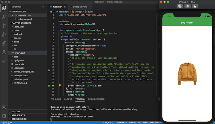
class App extends StatelessWidget { @override Widget build(BuildContext context) { return Container( decoration: BoxDecoration( color: Colors.white, image: DecorationImage( alignment: Alignment.center, image: AssetImage("assets/images/jacket4.png"), ) ), ); }
}
We set the fontFamly of the app to Roboto and returned an image located in the images folder inside the assets directory. Here’s the result:
Putting it all together
No Flutter application is complete without at least one or two of the widgets we explored in this tutorial. However, there are a few other basic building blocks that you should master before diving into your Flutter app development journey — namely, TabBar and AppBar
TabBar enables your users to quickly glance at menu options and move between categories with a single swipe. To learn more, see our Flutter TabBar tutorial.
The AppBar is a dedicated widget in Flutter for housing search fields, buttons, page titles, etc. Check out our guide to customizing the Flutter AppBar.
The post Widgets: The building blocks of Flutter apps appeared first on LogRocket Blog.